1830
THE BEGINNING
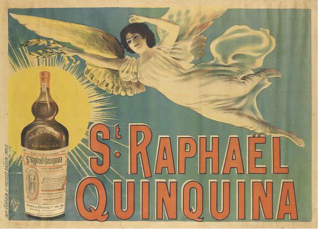
It all started in 1830, when Dr Adémar Juppet began working on an aperitif made from Quinquina and wine. After spending many long nights perfecting the beverage, his eyesight began to fail. Remembering the biblical epitaph in which Archangel Raphaël famously heals Tobit of his blindness and hoping to recover his eyesight so he could finish his research, Dr Juppet prays to the archangel for help with his elixir. When his prayers are answered and the recipe is completed, he names his creation St Raphaël.
1932
THE BIRTH OF
THE ST RAPHAEL WAITERS
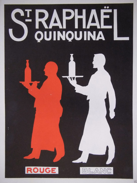
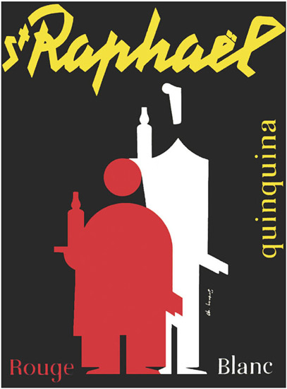
1932 marks a new chapter in the iconographic history of St Raphaël, with the two waiters appearing for the first time on the brand’s various creations. These two silhouettes, also known as the “Twins”, are inspired by actors Armand Bernard and Paul Marien (better known as “Pauley”). The red figure symbolizes St Raphaël Red and the white figure St Raphaël Amber. They give the brand a unique character and soul.
1900
THE UNIVERSAL EXHIBITION
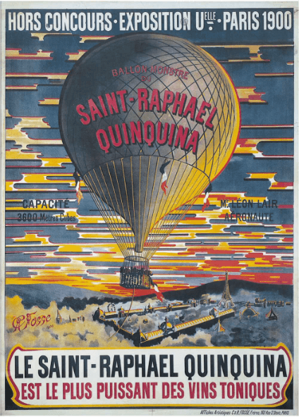
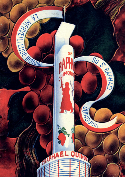
Already enjoying international renown, it is at the Paris Universal Exhibition of 1900 that St Raphaël really takes off. Here, the brand becomes a household name, with its own pavilion on the edge of the Trocadéro. St Raphaël is the first brand of aperitif at this important event to offer visitors a trip in a giant hot air balloon in the brand’s colours, with aeronaut Léon Lair at the helm.
1936
CHARLES LOUPOT : AN IMPORTANT ENCOUNTER
In 1936, in what would prove to be a pivotal encounter, Max Augier, head of advertising and future director of St Raphaël, meets Charles Loupot, a renowned poster artist with a very original style. The two quickly set up a lasting partnership focused on promoting the St Raphaël brand.
1937
THE INTERNATIONAL EXHIBITION
In 1937, Max Augier commissions Charles Loupot to produce a poster for the Paris International Exposition of Art and Technology.
To honour the event, the artist comes up with the idea of displaying the two waiters above the Champs de Mars, boldly using the three national colours of France.
A temporary St Raphaël tower is even built.
The building, described as a “magnificent piece of French art”, receives hundreds of thousands of visitors who are invited to taste a glass of ice-cold St Raphaël served with a twist of lemon.
In 1947, Max Augier creates a studio for Loupot dedicated to St Raphaël. The poster artist surrounds himself with young Swiss graphic designers like Werner Häcshler.
Together they set up a modular system for producing all of the visuals in the brand’s graphic charter, including the famous St Raphaël logo.
In 1953, he releases one of the brand’s most classic posters depicting the waiters face on, an image that would inspire him in later years and which would be used and reworked in various formats and objects.
1938
MODERNIZATION
WITH CHARLES LOUPOT
In 1938, Charles Loupot initiates a real turning point for St Raphaël, completely redefining the brand’s graphics. This includes creating new scripted lettering for the brand name and a new version of the two waiters using strict geometric shapes. At the end of the war, Loupot redesigns the waiters again, using even more minimalist shapes.
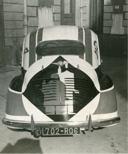
A new chapter begins for St Raphaël when, in the 1950s, artist Rolf Ibach joins the “Les Arcs” art agency created by Max Augier for Loupot, with Ibach helping bring to life the new stylized graphic charter. In just a few years, Ibach has more than 3,000 murals painted in France and covers numerous vehicles in the St Raphaël colours. These destructured advertising campaigns pay testament to Loupot’s intelligence, talent and modernism.
1954-1964
CYCLING
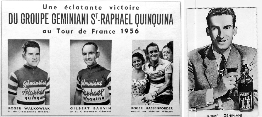
In 1954, St Raphaël turns its hand to sport, sponsoring a team in the Tour de France for almost 10 years and promoting its products at the event. Using the same name, the Raphaël Germiniani-Dunlop team, which was founded in 1954, sports the brand’s colours (red, black and white) every year. The team’s success further increases France’s love for the aperitif and its importance in their daily lives.
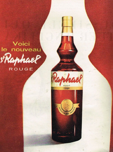
1962
A NEW TURNING POINT
FOR THE BRAND
A 1962 campaign announces the launch of a new bottle shape with the distinctive bulb neck becoming even more angular. Charles Loupot passes away the same year, leaving a priceless legacy for St Raphaël and art in general. Moving away from the purely graphic approach pursued by Loupot over many decades, St Raphaël begins to focus its communication on moments of life, beauty and joy. It is an era of slogans, with many famous artists gladly lending their name to the brand, including French comedian Bourvil and singer Dalida.

2018
In 2018, St Raphaël continues to innovate, paying tribute to Charles Loupot’s talent and creativity with the creation of a new premium range of Quinas, with 1950s style graphics referencing a key era for the brand. Strongly rooted in the world of bistros, St Raphaël has long been inspired by the graphics of the 1930s. For more than 20 years, the two waiters, symbols of the French way of life, have adorned our bottles alongside the archangel responsible for the brand’s creation.
1830
THE BEGINNING
It all started in 1830, when Dr Adémar Juppet began working on an aperitif made from Quinquina and wine. After spending many long nights perfecting the beverage, his eyesight began to fail. Remembering the biblical epitaph in which Archangel Raphaël famously heals Tobit of his blindness and hoping to recover his eyesight so he could finish his research, Dr Juppet prays to the archangel for help with his elixir. When his prayers are answered and the recipe is completed, he names his creation St Raphaël.
1900
THE UNIVERSAL EXHIBITION
Already enjoying international renown, it is at the Paris Universal Exhibition of 1900 that St Raphaël really takes off. Here, the brand becomes a household name, with its own pavilion on the edge of the Trocadéro. St Raphaël is the first brand of aperitif at this important event to offer visitors a trip in a giant hot air balloon in the brand’s colours, with aeronaut Léon Lair at the helm.
1932
THE BIRTH OF
THE ST RAPHAEL WAITERS
1932 marks a new chapter in the iconographic history of St Raphaël, with the two waiters appearing for the first time on the brand’s various creations. These two silhouettes, also known as the “Twins”, are inspired by actors Armand Bernard and Paul Marien (better known as “Pauley”). The red figure symbolizes St Raphaël Red and the white figure St Raphaël Amber. They give the brand a unique character and soul.
1936
CHARLES LOUPOT : AN IMPORTANT ENCOUNTER
In 1936, in what would prove to be a pivotal encounter, Max Augier, head of advertising and future director of St Raphaël, meets Charles Loupot, a renowned poster artist with a very original style. The two quickly set up a lasting partnership focused on promoting the St Raphaël brand.
1937
THE INTERNATIONAL EXHIBITION
In 1937, Max Augier commissions Charles Loupot to produce a poster for the Paris International Exposition of Art and Technology.
To honour the event, the artist comes up with the idea of displaying the two waiters above the Champs de Mars, boldly using the three national colours of France.
A temporary St Raphaël tower is even built.
The building, described as a “magnificent piece of French art”, receives hundreds of thousands of visitors who are invited to taste a glass of ice-cold St Raphaël served with a twist of lemon.
1938
MODERNIZATION
WITH CHARLES LOUPOT
In 1938, Charles Loupot initiates a real turning point for St Raphaël, completely redefining the brand’s graphics. This includes creating new scripted lettering for the brand name and a new version of the two waiters using strict geometric shapes. At the end of the war, Loupot redesigns the waiters again, using even more minimalist shapes.
In 1947, Max Augier creates a studio for Loupot dedicated to St Raphaël. The poster artist surrounds himself with young Swiss graphic designers like Werner Häschler.
Together they set up a modular system for producing all of the visuals in the brand’s graphic charter, including the famous St Raphaël logo.
In 1953, he releases one of the brand’s most classic posters depicting the waiters face on, an image that would inspire him in later years and which would be used and reworked in various formats and objects.
A new chapter begins for St Raphaël when, in the 1950s, artist Rolf Ibach joins the “Les Arcs” art agency created by Max Augier for Loupot, with Ibach helping bring to life the new stylized graphic charter. In just a few years, Ibach has more than 3,000 murals painted in France and covers numerous vehicles in the St Raphaël colours. These destructured advertising campaigns pay testament to Loupot’s intelligence, talent and modernism.
1954-1964
CYCLING
In 1954, St Raphaël turns its hand to sport, sponsoring a team in the Tour de France for almost 10 years and promoting its products at the event. Using the same name, the Raphaël Germiniani-Dunlop team, which was founded in 1954, sports the brand’s colours (red, black and white) every year. The team’s success further increases France’s love for the aperitif and its importance in their daily lives.
1962
A NEW TURNING POINT
FOR THE BRAND
A 1962 campaign announces the launch of a new bottle shape with the distinctive bulb neck becoming even more angular. Charles Loupot passes away the same year, leaving a priceless legacy for St Raphaël and art in general. Moving away from the purely graphic approach pursued by Loupot over many decades, St Raphaël begins to focus its communication on moments of life, beauty and joy. It is an era of slogans, with many famous artists gladly lending their name to the brand, including French comedian Bourvil and singer Dalida.
2018
In 2018, St Raphaël continues to innovate, paying tribute to Charles Loupot’s talent and creativity with the creation of a new premium range of Quinas, with 1950s style graphics referencing a key era for the brand. Strongly rooted in the world of bistros, St Raphaël has long been inspired by the graphics of the 1930s. For more than 20 years, the two waiters, symbols of the French way of life, have adorned our bottles alongside the archangel responsible for the brand’s creation.